Staffing Panel
A tool to make staffing operations people’s lives easier.
My Contribution
Design Work
Discovery
Product management
Wireframing
User Flows
Final Design
Context
Tend is a marketplace for hospitality professionals. We connect clients with the most qualified Tenders – That’s how we call our professionals – for their gig.
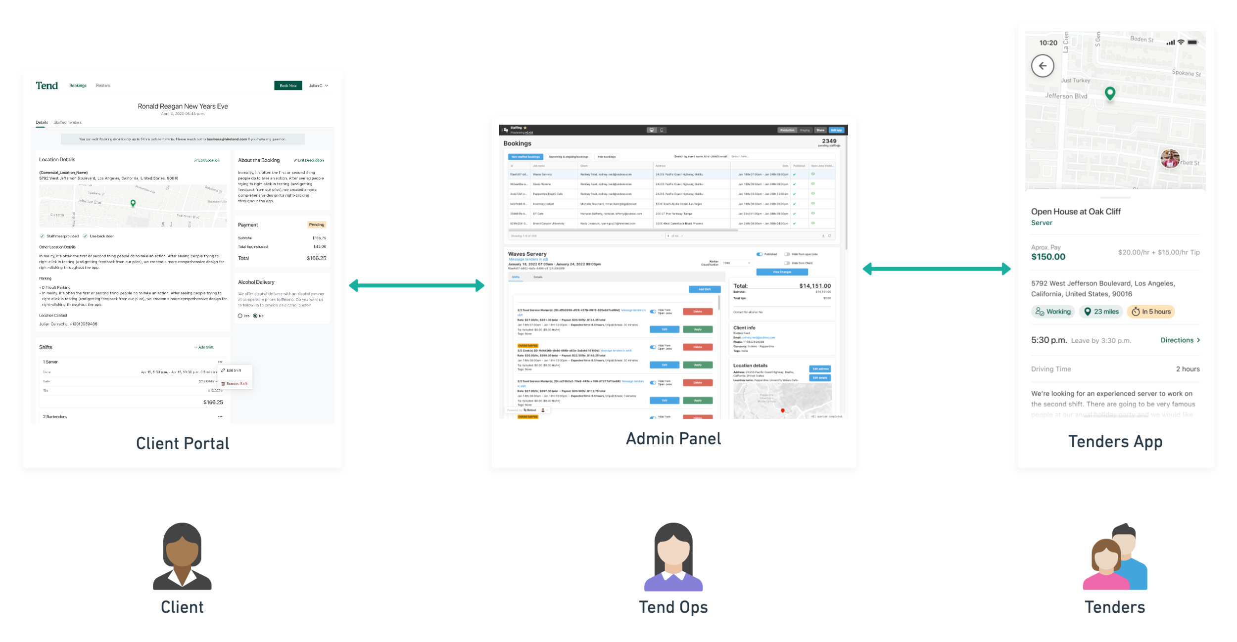
Being a very early stage startup client and professionals facing applications were prioritized above internal tools. Thus, we relied on a 3rd party called Retool to create our Admin Panel and have all the basic functionality in place for us to be able to be operational.
Once we had a Client Portal for clients to create bookings and a mobile app for Tenders to apply to shifts, we started to create our own internal tools so our operations could be more efficient and scalable.
The problem
Retool Admin Panel is slow, too restrictive on its components and prone to crash. We needed something more reliable when staffing for the future high demand.
In the existing solution, there was no way for ops to conduct matching at the shift level for open shifts and applicants. At that moment, staffing activities had to be done within the context of a booking, where shifts were not selectable and applicants lived in a single table where it was difficult to distinguish which ones belonged to the different shifts.
How might we allow users to staff shifts more efficiently, giving the information they need to do it effectively?
How can we adapt to their mental model instead of making them adapt to the existing solution?
Existing Solution
Goals
Deliver value fast before the high demand season
We took advantage of the low season – and COVID closures – to start working on our internal tools but we needed to move fast in order to be ready for when events came back with a the super high demand we were expecting.
Create our own specialized tool for staffing and remove 3rd party dependency
Retool is a great tool, very customizable and easy to pick up but we needed a tailored tool four our operations to perform at their best
Constraints
Design
No clutter. Show information only when needed
Need for clarity in design to reduce confusion
Pre-established processes that cannot change as fast
Very few current users so we could’ve ended up with something that worked for a couple of people but not for new hires or anyone else
Technical
Build new table components
Move functionality to new Admin Panel created by us
Manage high volume of data display
Business
Time – Pandemic restrictions coming to an end/pause
Unavailable product manager
Requirements
The staffing team needed to be able to see all the people that has applied to a shift, examine their fit for the job and staff them or deny their application.
They should also be able to filter shifts by region, client, date and more.
With that in mind I proceeded to generate some design alternatives with some wireframes.
Exploration/Wireframing
I worked with different stakeholders on ideation excercises so we could go broad on the ideation phase, and later refine the best ideas.
Wireframing
Inspiration: Existing Design Patterns
I looked for inspiration on design patterns being used on other applications. I focused mostly on ways to display more information only when needed as a way of not cluttering the screen.
High Fidelity Design
Shift
For every shift, operations people can see:
Who has applied
Who has been approved
Who is not attending either because they were denied or because they called-out
There are other bits of information that help them to take the best decision on wether someone is a good fit for the job or not, e.g. if the client has expressed any preference for them or blocked them, if they have any conflicts with other events they are working on or how far they live from the venue.
Tender Card
It was really important for us to be able to show only relevant information at any time during the staffing process.
Usually, Operations staff will only need the information displayed on the table but sometimes they would need to know more about Tenders in order to decide which one should work the shift. That’s why I decided to create a Tender Card where more detailed information about the Tender is available, including:
Softskills & Hardskills
# of jobs worked
Denial Streak: How many times we have denied this person in a row. If they are too many, we giver preference to them so they don’t lose engagement.
etc.
Apply for Tender
Staffers have the ability to apply on behalf of another Tender that has not applied to the shift, which often happens when there is the need for more applicants or when staffers know the client and some Tenders that would fit the job. They can also auto-approve the added Tenders so they don’t have to perform more actions when they have added them
Filters
I also worked on multiple filters for both Tenders and Shifts
Outcomes
This was a really interesting project. I enjoyed learning about the nuances of staffing and actually delivering a solution that was more effective than the one we are replecing.
In terms of product design process, I exercised a lot of compromising. We developed this solution in different phases where, at the beginning, not all the desired functionalities were going to be available. This way of doing it allowed the team to deliver some value faster than waiting for the whole thing to be done.
We are still iterating over this solution, which obviously was not perfect. Constant learning about its performance in a real environment is crucial to improve it in the future.


