Tenders App
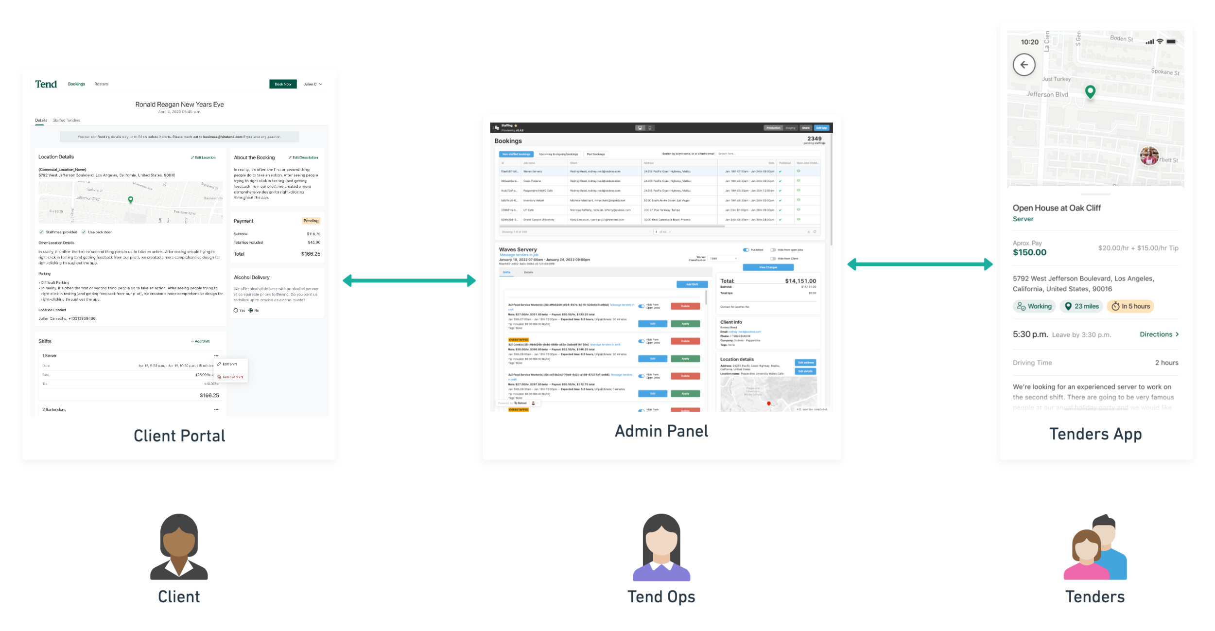
The bridge between our clients and our Tenders.
My Contribution
Design Work
Discovery
Product management
Wireframing
User Flows
Branding
Final Design
Context
Tend is a marketplace for hospitality professionals. We connect clients with the most qualified Tenders – That’s how we call our professionals – for their gig.
When I joined the company, the technology side of the company was not there yet in terms of development. Our admin panel was Airtable based, we did not have a client portal or any other website or tool that our clients could use to create bookings and most importantly, we did not have a tool for professionals to apply to gigs. All our applications were being made via phone call, email or sms.
Given de urgency, we decided to work on a Tenders App as our very first project as product team along with the recently hired developers.
The problem
All applications and communication with professionals – Tenders – were happening via different channels. Information given even among Tenders working on the same shift was not consistent and there was a lot of confusion on what the was the process to follow before, during and after the event.
We needed a tool for Tenders to discover and apply to events but also a place where they could see any relevant information and instructions about the event.
We also needed a place for professionals to apply to positions and become a Tender.
How might we allow Tenders to discover relevant jobs for them?
How might we distribute consistent instructions/information to all Tenders working on the same shift?
How might we monitor Tenders before and during the event? How do we make sure they are actually working the shift and getting there on time?
Goals
Deliver value fast
When we decided to create the app, Tend was already working with clients and staffing Tenders on some events but everything was being done somewhat manually or using tools not specifically designed for it. Thus, we needed to deliver a functional MVP as soon as possible so we could give a little more formality to our business.
Have relevant information available for Tenders at different times during the job lifecycle
We needed to deliver consistent information to all Tenders working on an event
Bring our own technology and development to the company
Most of the things being done at the company – at that time – were done using third party tools like Airtable, Google Docs or sms and email so it was important for us to start making the shift to be a real technology company and start creating our own products
Constraints
Design
Start from scratch. There was no previous work done in terms of design so we needed to explore alternatives in both functionality and looks
Tend follows an unconventional flow where Tenders have to apply to shifts and then be approved or rejected which presented product design challenges
One person design team
Technical
Tenders were using both Android and iPhone but we didn’t have the resources to go native on both so we decided to use React Native.
Location tracking use and resource management (Phone)
Business
Different approach to staffing versus other companies in the industry.
Needed to translate a more traditional mom-and-pop business to a tech startup
Requirements
We wanted Tenders to have the ability of:
Registering as a Tender and apply to different positions (e.g. bartender, server, host, etc.)
Find relevant shifts to work based on positions and location
Apply to shifts
Confirm shifts, as in confirming that they are actually going to a shift they were approved to work
See relevant information to the shift. This information needs to be different when before they are approved to work the shift and after
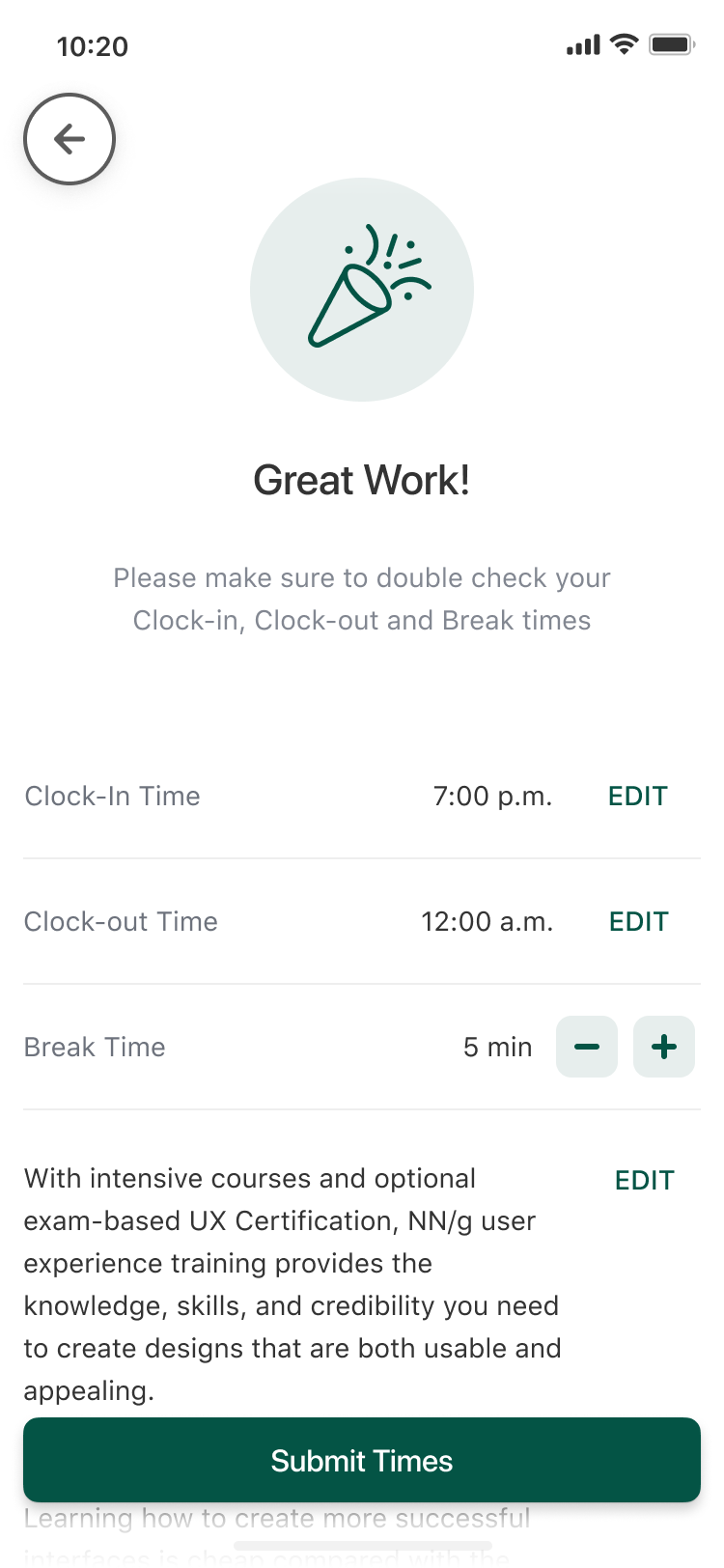
Later in the development we added the ability to clock in and out of the shift
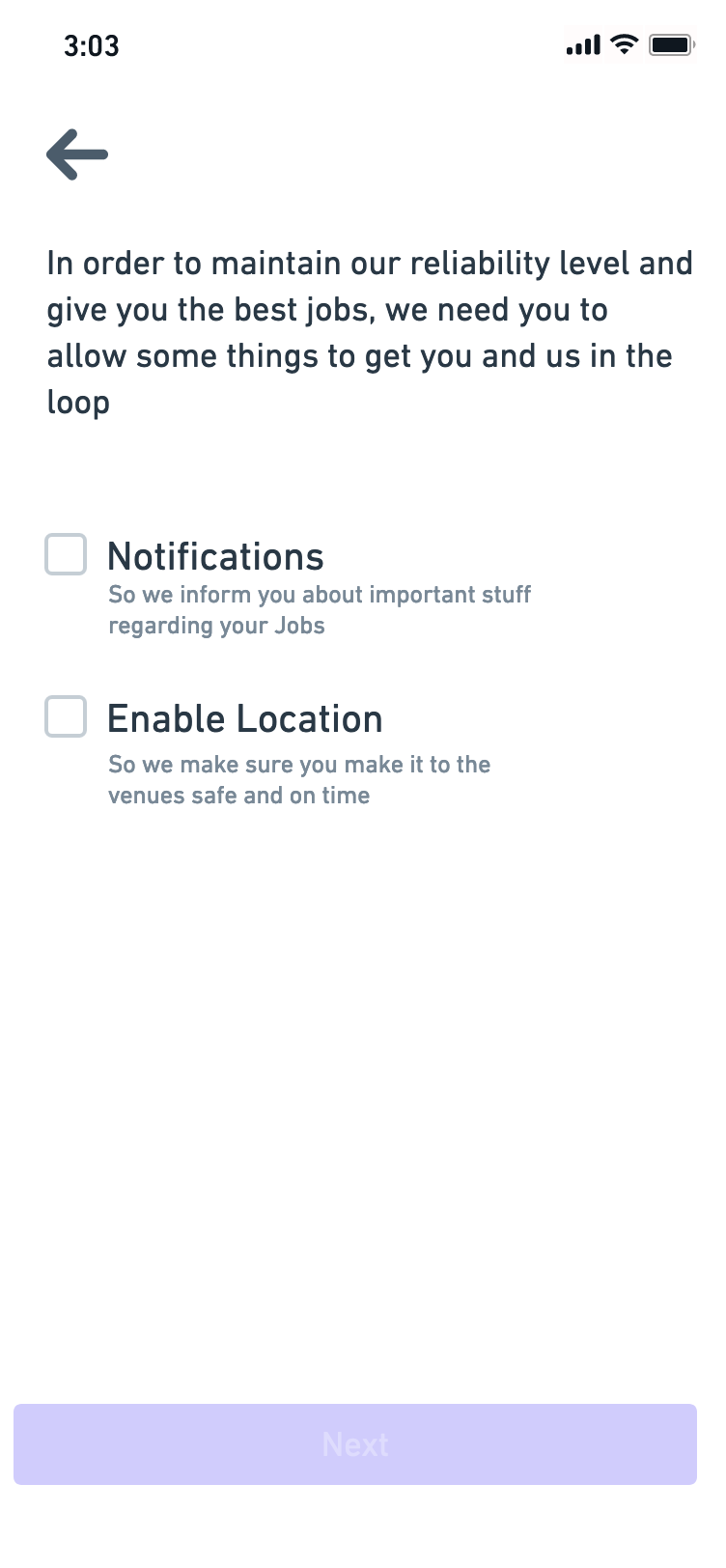
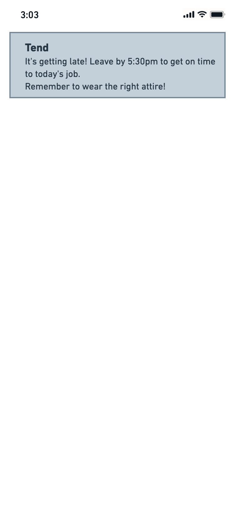
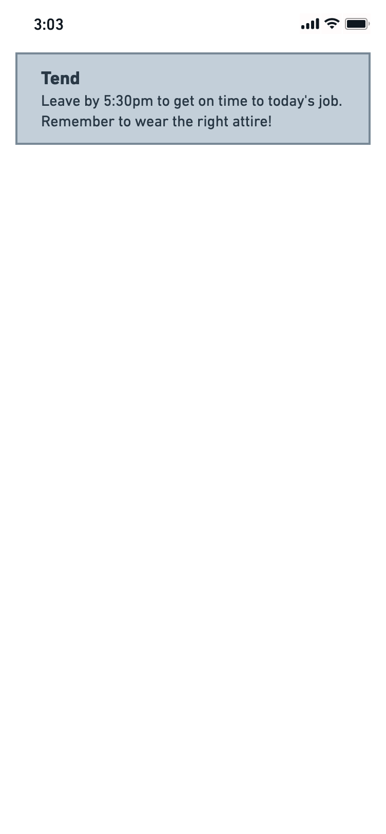
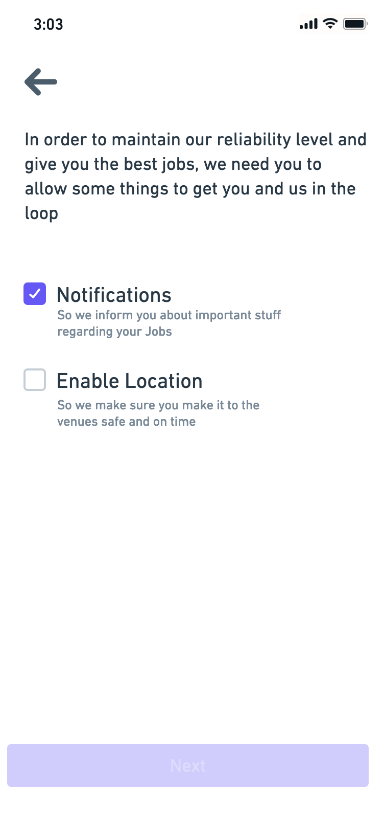
We also needed to have location tracking capabilities so the Operations team could monitor Tenders and react when there is a probability of them not showing up at work.
Visual Exploration & Wireframing
I worked with different stakeholders on ideation excercises so we could go broad on the ideation phase, and later refine the best ideas. At the same time I worked on a visual exploration that would determin how the application would look like.
Visual Exploration
Testing Script
Testing prototype
Discovery
I decided to run a quick discovery around the problem space. This discovery consisted on some user interviews done with real Tenders.
Questions were focused on their experience as gig workers with us and with other companies. It also included some quick usability testing with a Figma prototype so we could validate some of the flows we were thinking of implementing.
Key findings:
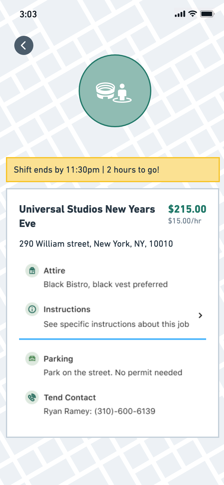
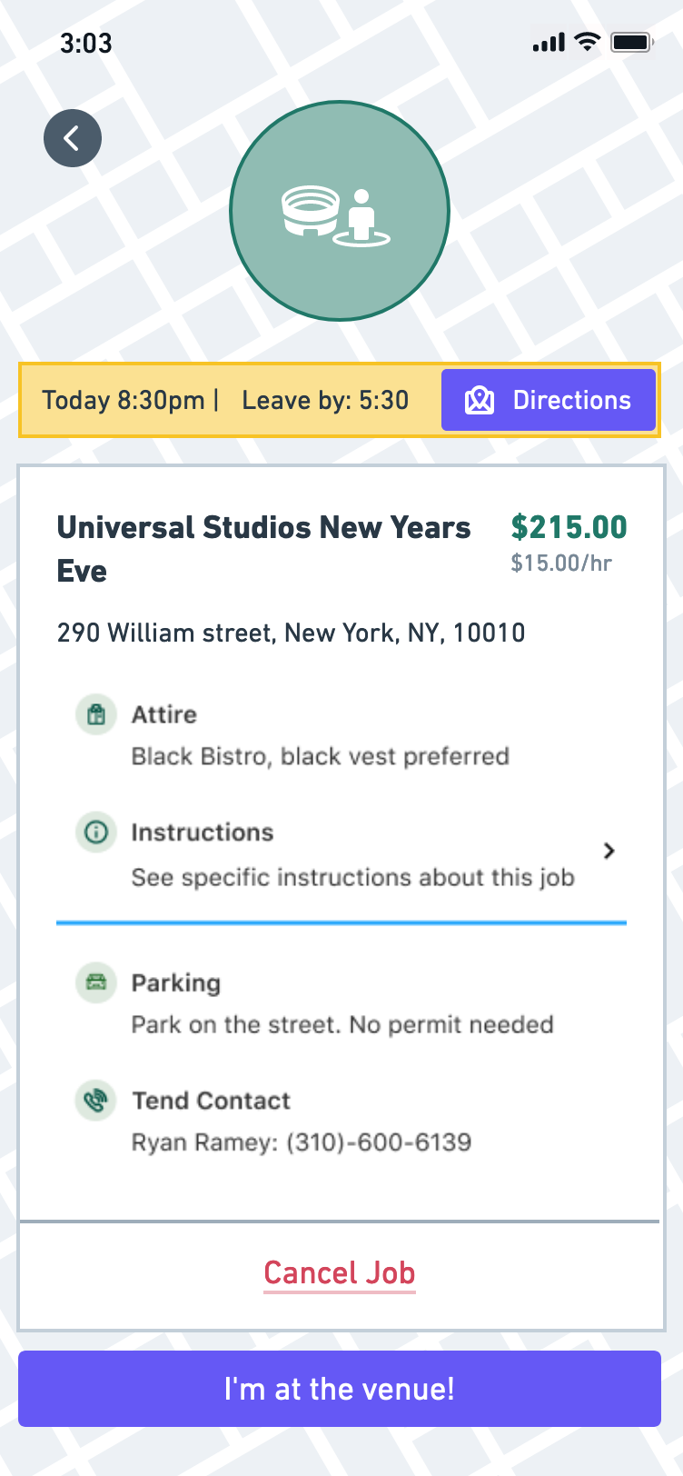
Tenders would like to know how far is the venue and if there is parking available
A lot of the times Tenders don’t know who to talk to when arriving to an event
They really like to have a real human available to contact when they have questions about a job
It gave us pretty good insights on how other companies were handling staffings
High Fidelity Design
Account Creation
We added the possibility for Tenders to create an account from the mobile application – which was not possible before –
Job Listing
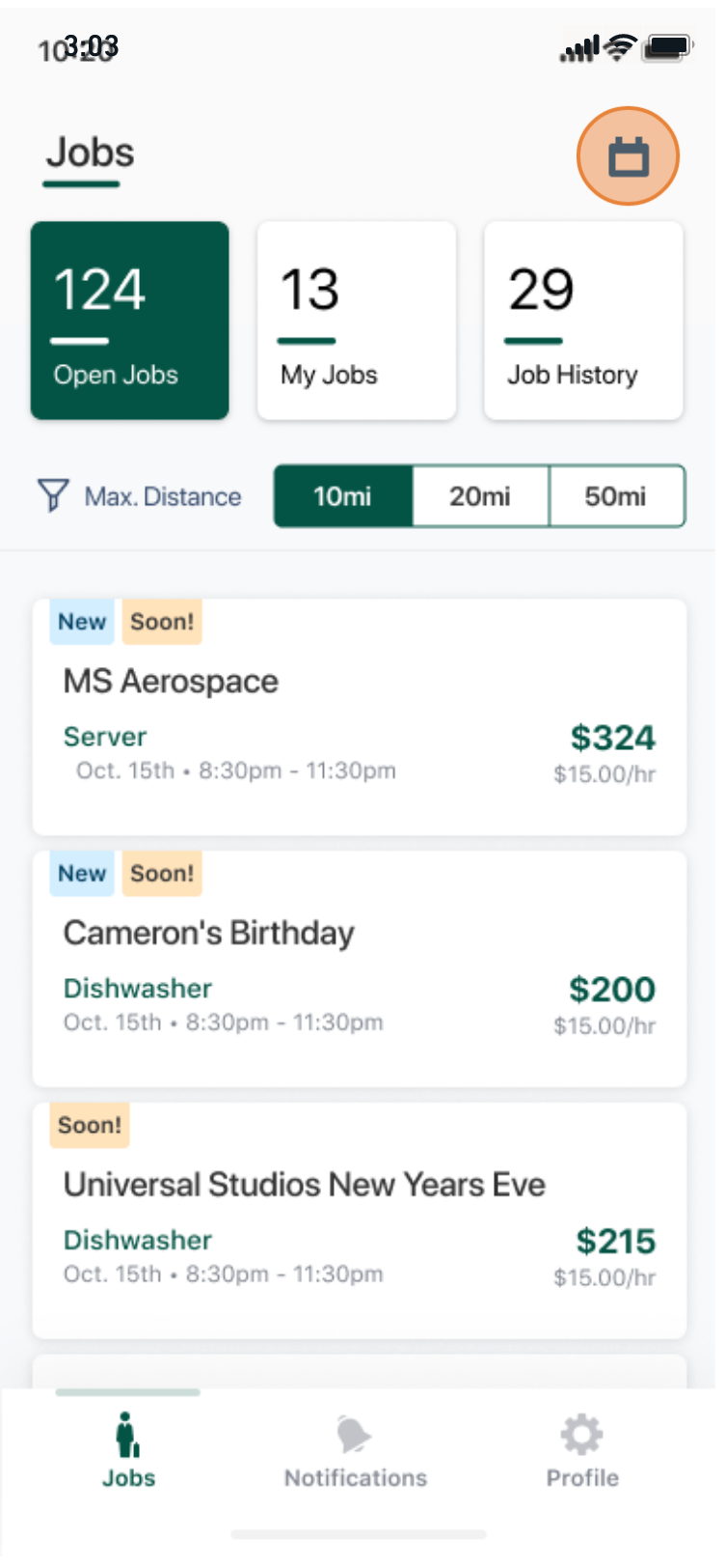
Once Tenders have approved positions, they are able to see open jobs for those same positions. We displayed jobs based on distance from their home address.
We also display relevant information even before they go into see the details like rate, tip, contract type (1099 or w-2), date, position, etc.
Job Detail
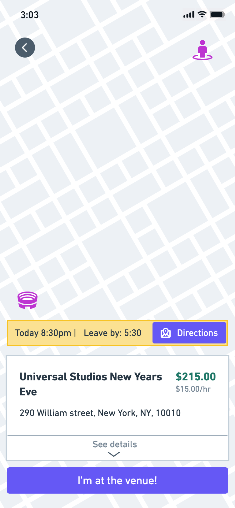
This was the most impacted section based on the insights we got from the initial interviews. I laid out the information in order of relevance for the Tender at the time they are looking at it.
This last part is very important not only for Tenders but for Clients and Operations staff as well. Tenders that have not been approved should only see relevant information like payment rates, general location, position and a brief description of what they should expect at the shift.
Once they are approved more specific information like the exact location and arrvival instructions, is disclosed.
Actions that can be taken in this section also change from being able to apply to confirm your attendace and clocking in and out when you finish the job.
Clock-out
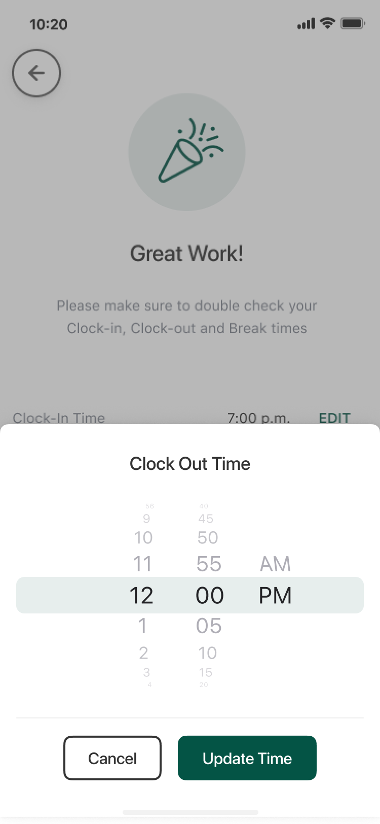
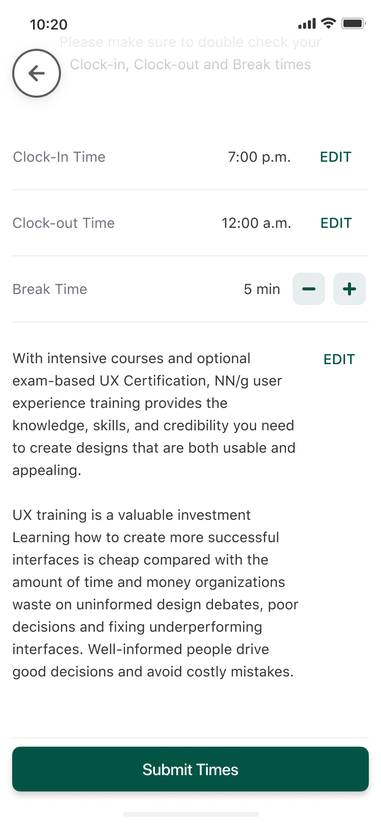
We needed a way for Tenders to clock-out from shifts so Ops can later send this information to clients and confirm that all the times match. For Tend was really important to do this as quick as possible so Tenders could receive their payment relatively quickly after they have worked the event.
I proposed adding an optional comments text area for Tenders to comments on the event. This would later prove to be very valuable for us as a way to obtain feedback for how Tend is doing but also feedback for the clients in case they thought the conditions were not the best or if they need to improve something in the relationship with their workers.
Outcomes
Even though we had to work super fast to take this project into production, We did it in a way that did'n’t compromise the core functionality that we needed to have for Tenders to use the app and work with us. We went for a quick releases approach, taking small functional units into production and then iterating over them.
This was a very challenging project to work as a solo designer. Still, I feel very good about they way I could handle it and even do some quick User Research and Discovery.
I’m also proud for designing solutions that offer value not just to our business and clients but also to our Tenders who are the backbone of what we do but sometimes can be overlooked.
