Roadmap
A tool for people that simply wanted to play, explore or sketch ideas before committing to create an entire plan.
My Contribution
Design Work
Sketching
Prototyping
Usability Testing
User Flows
Final Mocks
Design System
Features I worked on
Roadmap interactions
Design system
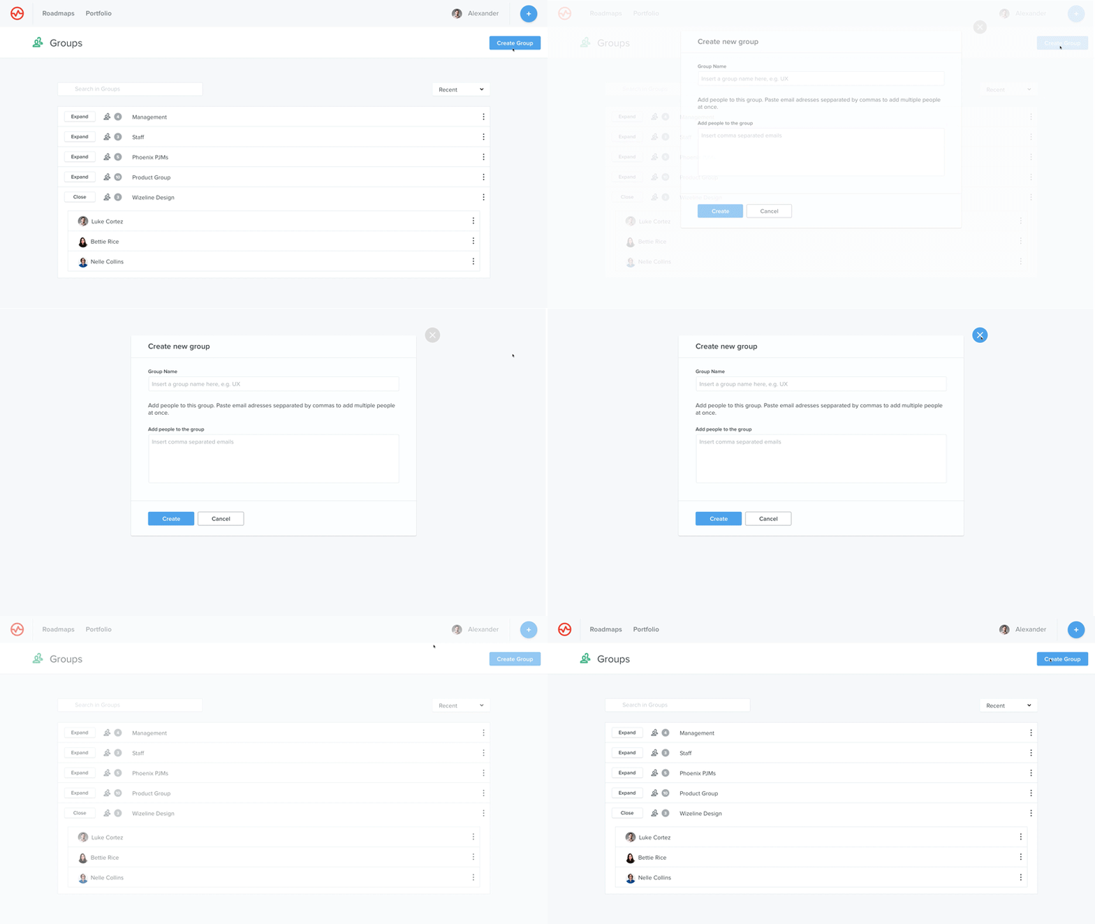
Roadmaps listing
Settings section
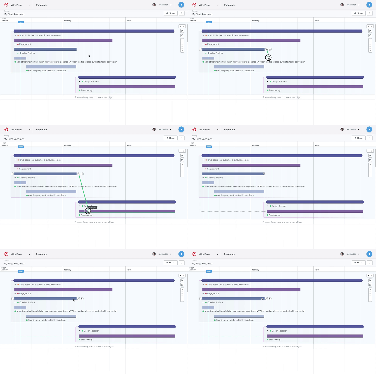
Links (Dependencies)
List View (Table view of the roadmap)
Item ownership
Change color functionality
Side panel
Comments
Context
When this project was started, Wizeline was a small startup with around 30 engineers. Our only product was Wizeline Portfolio, a product management tool that allowed users to define, prioritize, visualize and share product plans. Wizeline Portfolio was a very robust tool that integrated with JIRA, Salesforce, Slack, among others; it allowed to create surveys to define what features were more important to build for product teams and delivered product management structures that strictly followed the best standards out there.
However, this robustness and the strict nature of the product management flow that Wizeline Portfolio enforced, prevented it to be adopted by a big segment of the market that had defined their own flows or simply wanted to play, explore or sketch ideas before committing to create an entire plan.
Wizeline Portfolio
It was a very robust product management tool. It had a very strict approach to product management methodologies and best practices.
The problem
Wizeline Portfolio's arbitrary structure to form plans prevented us to get more users. Customers were feeling limited in their ability to ideate plans inside the tool and we were not able to sell to as many new clients as we would like.
Executives, engineering team and design team decided to create a tool with that flexibility built into it since the beginning. We started to build an MVP of Wizeline Roadmap.
How can we allow users to explore ideas before committing to create a complete plan from the beginning?
How can we adapt to their structure instead of having them adapt to ours?
Goals
Deliver value fast
We needed Wizeline Roadmap to deliver value as soon as the users started using the app. Allow them to create a roadmap from scratch, dragging and dropping elements, drawing an idea of what their plan could be without dumping huge amounts of information to be able to see and share something useful.
Be the one tool for planning. Centralized product planning information
We wanted to remove the need for product managers to use multiple tools to create and share roadmaps that might have not been designed for that purpose (power point, excel, among others). Our ultimate goal was to be the only tool that product managers would need to create, manage and share a product plan.
Constraints
Design
Usable interactions. Our interactions should be fast, discoverable and easy to understand
Overcome previous crowded UI design (Wizeline Portfolio)
Intuitive. Users learning curve to use the tool should be minimal and the interface should have the affordances needed to interact with it and have the expected results
Technical
Real time updating
Versioning
SVG vs Canvas
Browser support
Business
Short time to prove value. We were under pressure to validate the market and our assumptions and show that building a new tool from scratch would have ROI in a short period of time
Costly to build. We would need to invest in infrastructure, engineering, design, marketing and all that required to build a new product while still maintaining Wizeline Portfolio alive
Research insights
Thematic analysis
Our previous discovery research gave us a lot of insights on what users needed, some of the things mentioned were:
An easy way to create plans from a high level and then complete them with more information later
Being able to share understandable roadmaps with stakeholders
Have a way to export data from a roadmap in an easy fashion
Create complex plans with multiple milestones and visualize ownership easily
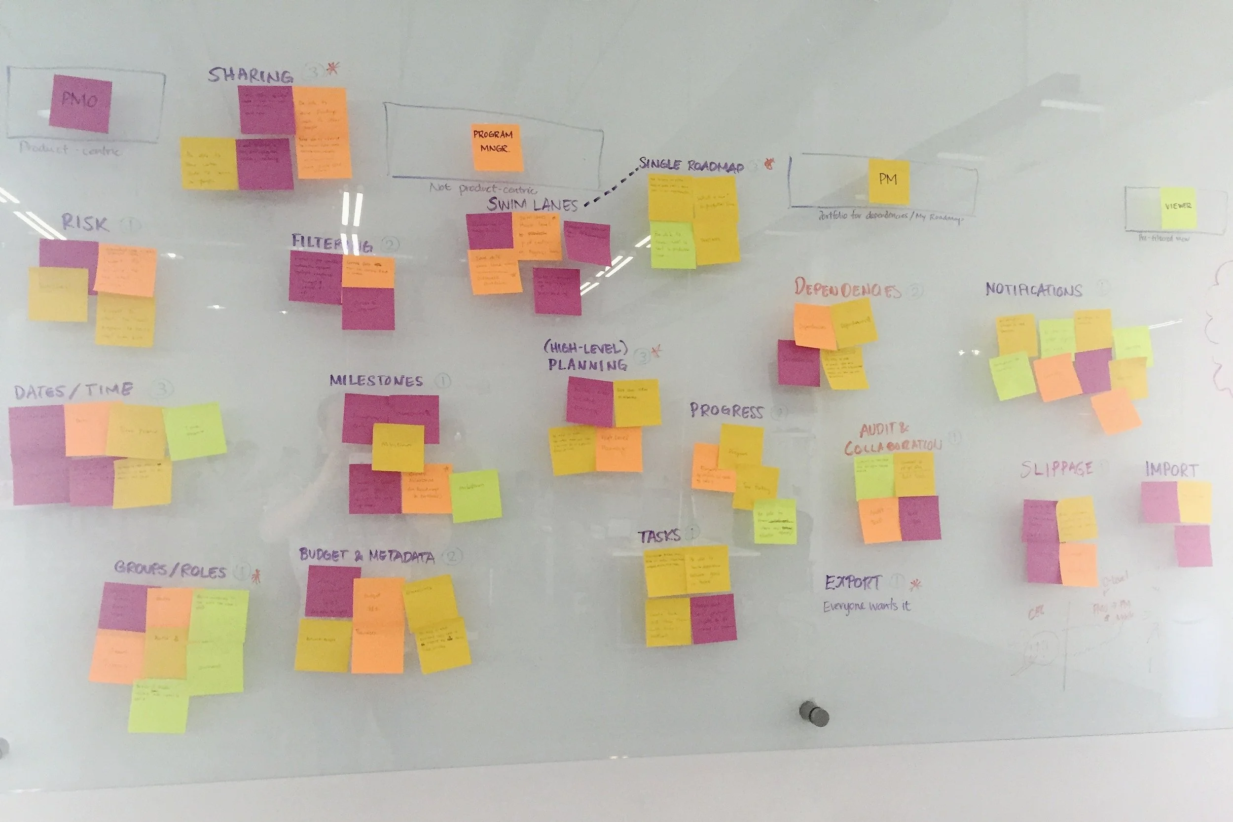
We used all the data from interviews with Wizeline Portfolio clients and intercom insights to generate an affinity diagram, creating big themes with the relationship that existed among the insights. This allowed us to know what these users have in common and what features would be important to include in our MVP.
Sketching
An ideation through sketching phase followed. Each of these sketches were validated internally to check functionality and technical feasibility.
In this initial exploration we were trying to solve how we could allow users to create roadmaps really quick, maintaining functionality and usability at the same time. We worked with some assumptions that would be validated later during our user testing sessions.
Some of the questions we tried to solve were:
How do I Create a new roadmap?
How do I create elements in my roadmap?
How do I create children?
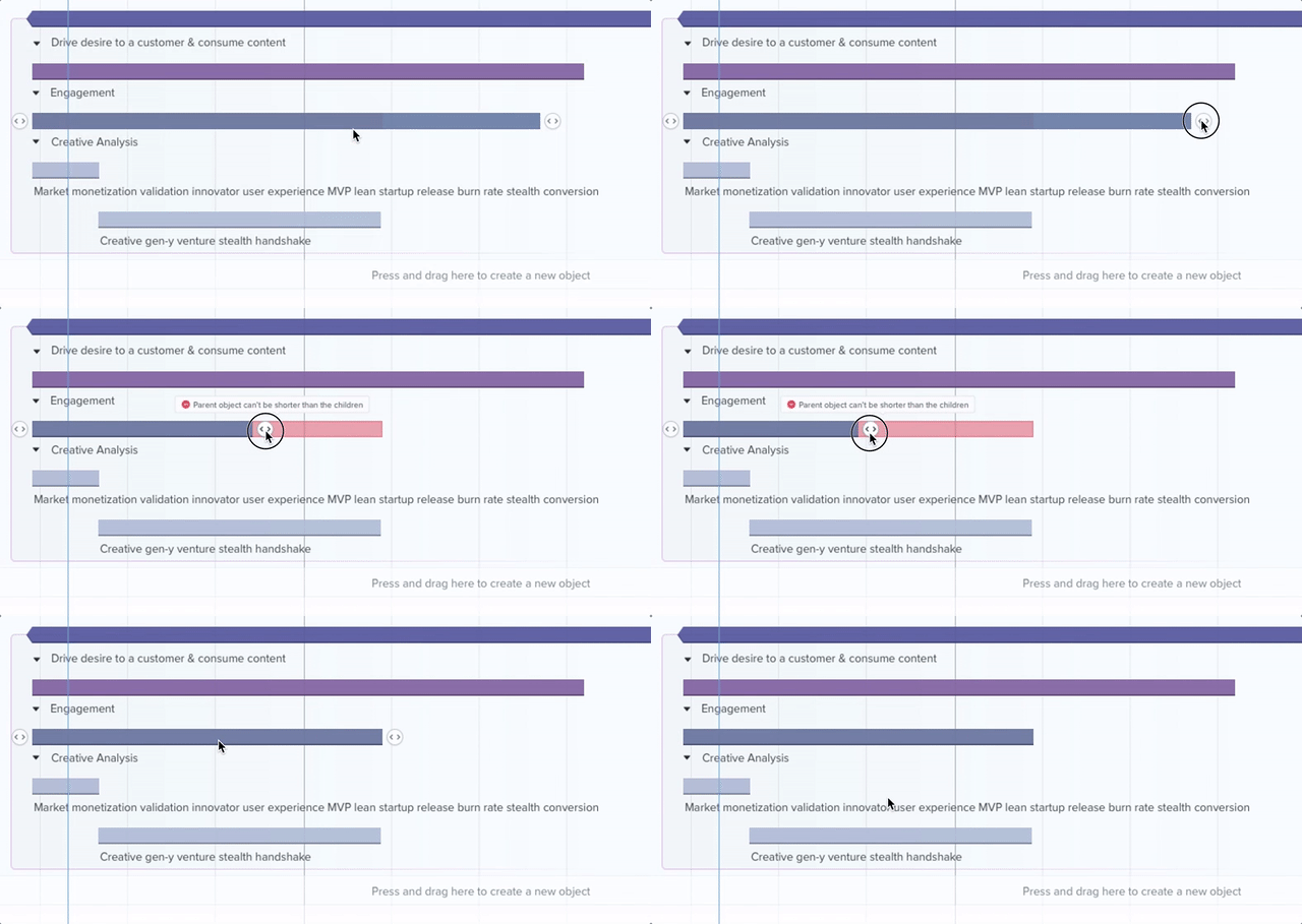
What happens if a child is longer than the parent?
Is a hierarchy necessary?
Should we enforce such hierarchy?
etc.
Wireframing/Prototyping
Several InVision and Framer Studio prototypes were created to test the workflows and the structure of the application interactions. InVision was used for more static interactions while Framer Studio was used for more dynamic interactions like drag and drop or resizing elements in the roadmap.
Framer Studio
Being a very visual and interactive tool, I needed to create interactive prototypes.
User Testing
For this project we wanted to make sure that all the roadmap interactions were the right ones and something that would adapt to the users' mental model. I did some guerilla user testing with project and product managers from Wizeline to see if the interactions were what they expected.
The user testing script had five activities that the user would perform during each session and a brief interview after the activities. These activities tried to cover the riskiest assumptions we made while designing the MVP and also discover urgent usability issues to solve.
We scheduled five user testing sessions with project managers working for potential client companies. During the sessions we observed them perform each activity while talking aloud which gave us a pretty good understanding of what they were expecting vs what we had designed.
Resizing Controls
One of the outcomes of user testing was the implementation of resizing controls as affordances that would allow users to understand easily how objects can be manipulated.
User testing session
Metrics
We continued measuring engagement and improving the product based on qualitative and quantitative data. I proposed the implementation of an analytics tool called Jaco.
We used Jaco to understand how people are using Roadmap and see what are the difficulties they find when using it and how the features we designed worked for them.


